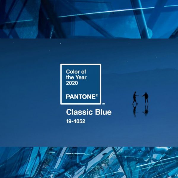
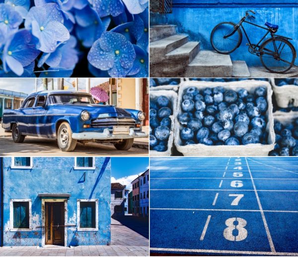
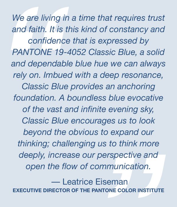
PANTONE has declared its Color of the Year for 2020 to be Classic Blue, or Pantone 19-4052. So it’s time to blue something as we’re all about to be incredibly blue. The high court of color has chosen a shade which is probably the truest of blue. The closest description might be cobalt or royal blue, but it’s a little calmer than that, not as bold. Yves Klein Blue or Yves Saint Laurent would have surely loved this anti-anxiety hue.
 Dry pigment and synthetic resin on paper mounted on canvas 62 x 111 1/2 inch
Centre Georges Pompidou – Musée national d’art moderne, Paris, France
© The Estate of Yves Klein c/o ADAGP, Paris
«Blue has no dimensions, it is beyond dimensions, whereas the other colors are not. They are psychological spaces; red, for example, presupposing a hearth releasing heat. All colors bring forth specific associative ideas, tangible or psychological, while blue suggests, at most, the sea and sky, and they, after all, are in actual nature what is most abstract.» – Yves Klein, Lecture at la Sorbonne, June 3rd 1959, Paris
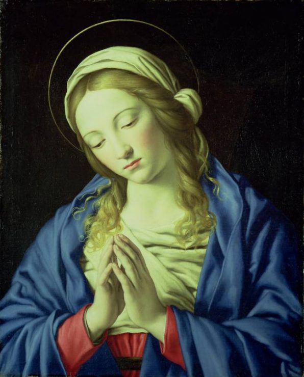
This artwork is showcasing the «true blue» pigment in perfection: the 17th-century painting The Virgin in Prayer by Giovanni Battista Salvi da Sassoferrato.
Another great example in the art world is by Dutch painter Johannes Vermeer. His famous work from 1665, Girl with a Pearl Earring, shows classic blue as the only bold burst of colour – in the form of a headscarf – among beiges, browns and a dark background.
You might be asking yourself, how did PANTONE land on this color? The color authority looks at trend forecasts, fashion, beauty, lifestyle, political views, media, street art, travel destinations, new technologies, and new textures — to name just a few of the categories they consider. Then it’s time to narrow it down to a color family, in this case it was a blue mood, «a reassuring presence instilling calm, confidence and connection».
This enduring blue hue highlights our desire for a dependable and stable foundation on which to build as we cross the threshold into a new era.
Imprinted in our psyches as a restful color, PANTONE 19-4052 Classic Blue brings a sense of peace and tranquility to the human spirit, offering refuge. Aiding concentration and bringing laser like clarity, it re-centers our thoughts. A reflective blue tone, Classic Blue fosters resilience.
As technology continues to race ahead of the human ability to process it all, it is easy to understand why we gravitate to colors that are honest and offer the promise of protection. Non-aggressive and easily relatable, the trusted PANTONE 19-4052 Classic Blue lends itself to relaxed interaction. Associated with the return of another day, this universal favorite is comfortably embraced.
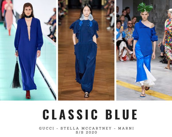
On the S/S 2020 runways, Classic Blue was omnipresent in all sorts of variations. As we all know, there is not «one» blue. In the 2006 film The Devil Wears Prada, Meryl Streep’s Miranda Priestly, gives a detailed speech about the varying shades of the colour blue, after Anne Hathaway’s Andy Sachs laughably questions how they could be distinguishable.
«… what you don’t know is that that sweater is not just blue, it’s not turquoise, it’s not lapis, it’s actually cerulean.»
This year marks the first time Pantone has introduced a multisensory approach to its Colour of the Year, partnering with several brands to showcase the taste, texture, scent and sound of Classic Blue.
Below you can shop some beautiful pieces in the Color of the Year 2020 – time to get ahead of the fashion game. Just click on the highlighted text to be transferred directly.
LoL, Sandra
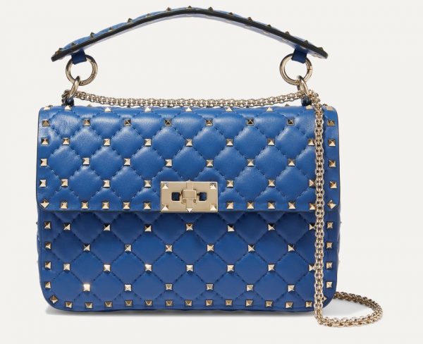
The Rockstud Spike medium quilted leather shoulder bag in Classic Blue by Valentino
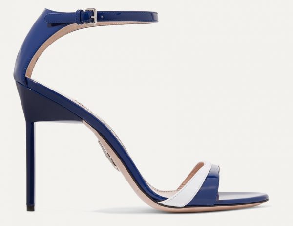
Two-tone patent-leather sandals in Classic Blue by Miu Miu
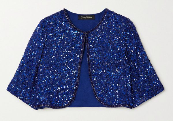
Viola cropped embellished chiffon jacket by Jenny Packham
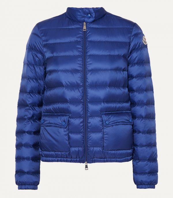
Quilted shell down jacket by Moncler
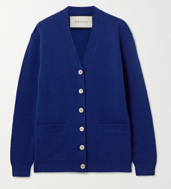
Intarsia wool cardigan by Gucci
Photos: Courtesy of the Brands, Artists, and via NY Post


