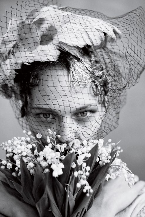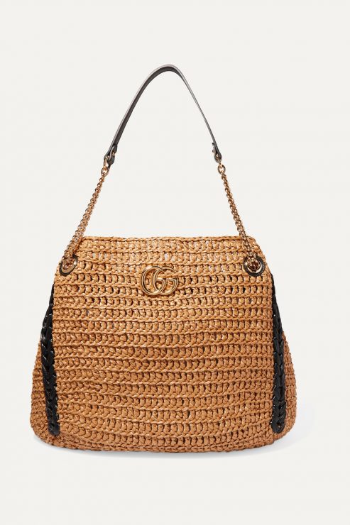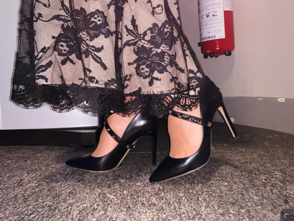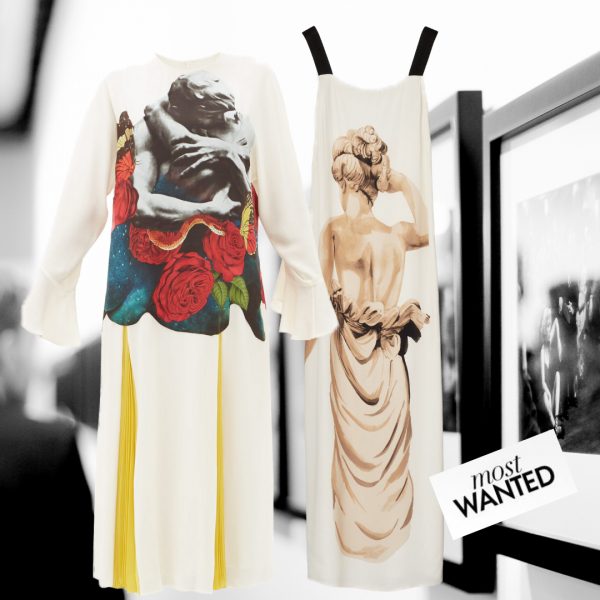
Oh, how wonderful spring is! With its bees, flowers, sun and now finally rain, it is my favorite season. One tradition I truly adore is the gifting of lilies of the valley on the first of May as a symbol of springtime and to wish happiness which is very popular in France. In many countries, the first of May is also National Labor Day. As a result, it is a public holiday that we get to enjoy.
 My first of May outfit: Lily of the valley-print pussy-bow silk blouse and Lily of the Valley-print pleated silk skirt, both by Valentino
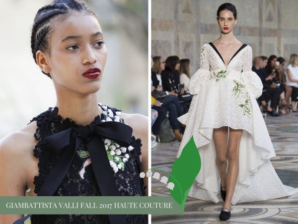
 Legend has it that the custom began on May 1, 1561 when King Charles IX received a sprig of the tiny flower as a token of good luck from knight Louis Girard. It is said that whoever finds a lily of the valley with 13 small bells will be particularly lucky.
The king liked the idea so much that he decided to start a tradition and presented a bouquet of lilies of the valley to each of the ladies of his court each year on the same day. And thus began the Fête du Muguet as it is called in France, or May Day.
 Christian Dior dedicated his whole Spring 1954 collection to his favorite flower.
The lily of the valley was also Christian Dior’s favorite flower and one of his lucky charms. Faithful to tradition, he offered it each May 1st to all his petites mains and clients. Christian Dior so cherished this spring flower that his florist, Madame Dedeban, grew it for him year-round in a specially heated greenhouse!
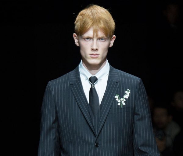 The Dior Hommes Fall 2014 collections full of lily of the valley details.
Thus, summer or winter, he was never without a sprig of it in his buttonhole. He also kept some in a finely-wrought box in his pocket. During preparations for his fashion shows, he would ask his petites mains to sew some sprigs of lily of the valley into the hem of a sleeve or a dress. Being the talisman it was, he was also prone to pinning it to the underside of the lapel of the suits worn by his models.
 The original Diorissimo bottle of 1956
His beloved flower was also present in his collections each season. He devoted an entire line to it for spring 1954, and, two years later, with Edmond Roudnitska, the couturier realized his dream of capturing its green and floral fragrance. And so, 1956 saw the launch of his third opus, Diorissimo, a triumph of olfactory prowess.
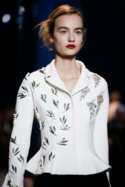 Dior Haute Couture S/S 2016
Lily of the valley has inspired the House’s perfumes and designs ever since, as it did the S/S 2016 haute couture collection. Sprigs of lily of the valley, traced out in beads and sequins, bloomed across a white Bar jacket, the result of over three hundred hours of embroidery.
 Kirsten Dunst at the 69th Festival de Cannes in 2016
Later in 2016, at the 69th Festival de Cannes, Kirsten Dunst ascended the famous steps in a white silk gazar Dior haute couture dress embroidered with 300 lily of the valley flowers.
 The famous dress Muguet from 1957 was on display at the amazing V&A exhibition «Christian Dior Designer of Dreams»
This special creation was inspired by the dress Muguet, designed by Christian Dior for his S/S 1957 collection in which the flower also blossomed on a dress named Mois de Mai.
 Surprise for my daughter today: The beautiful Lucky scent engraved with her name and sign.
In 2018, the Maison launched Lucky as part of their Maison Christian Dior Collection – another fragrance that features lily of the valley, in combination with white flowers and ozonic notes. The nose behind is Francois Demachy, Parfumeur-Créateur Dior, who says:. “Christian Dior was very superstitious and would stitch a stem of lily of the valley into the seam of his dresses for good luck. I wanted to represent the perfume of this hidden lily of the valley, sewn into metres of silk, with a profusion of white flowers and freshness. The scent of his favourite flower gradually reveals itself. Lucky is a good luck charm and the perfume to wear whenever you want to cross your fingers.”
 Dior’s new Lily of the Valley china is so beautiful, click here for more infos.
And last but not least, a very sweet fairytale tells of the affection between the lily of the valley and a nightingale. Once upon a time, every night, the nightingale would come to the garden to sing. However, the lily of the valley was shy and hid herself from the bird. The nightingale was lonely and said he would no longer sing unless the lily of the valley revealed herself, and promised to bloom every May for all to see. And so she does.
LoL, Sandra

Photos: Courtesy of Dior, Giambattista Valli, Vogue and © Sandra Bauknecht
DISCLOSURE: This post may contain affiliate links, meaning when you click the links and make a purchase, we receive a commission.
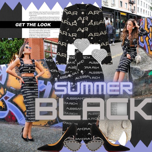
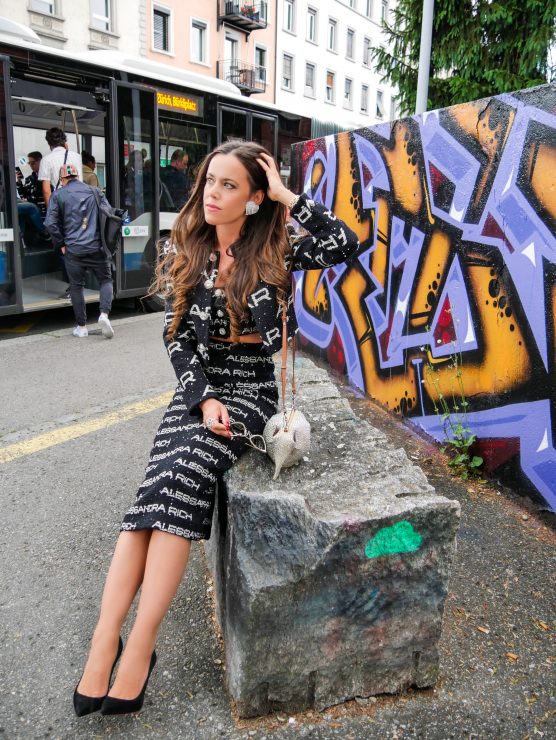
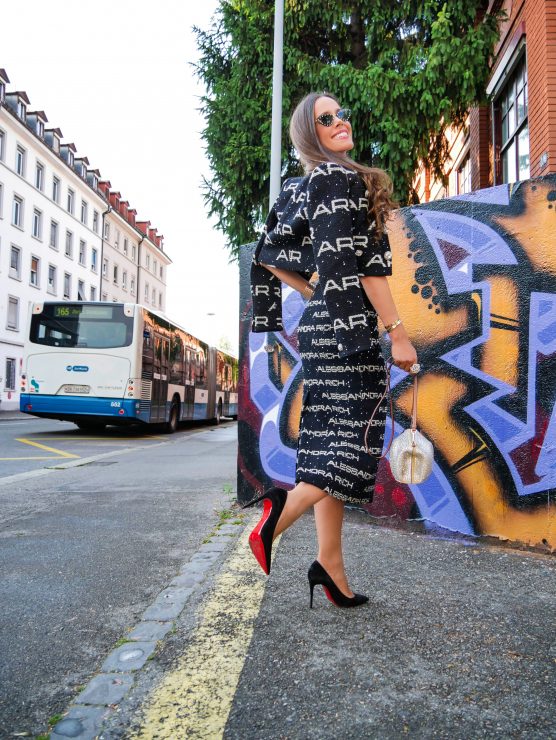
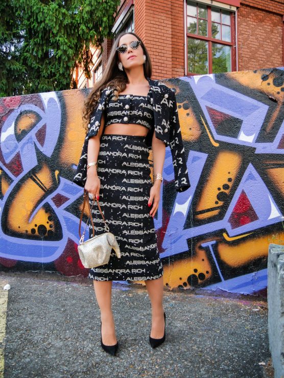
, sequin-embellished cotton-blend tweed midi skirt, cropped sequin-embellished cotton-blend tweed top
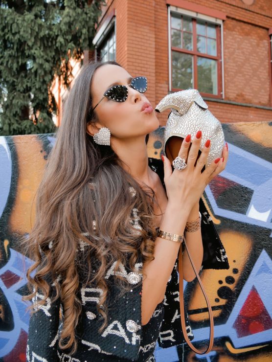
, and silver-tone crystal clip earrings
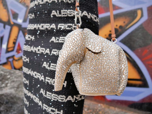
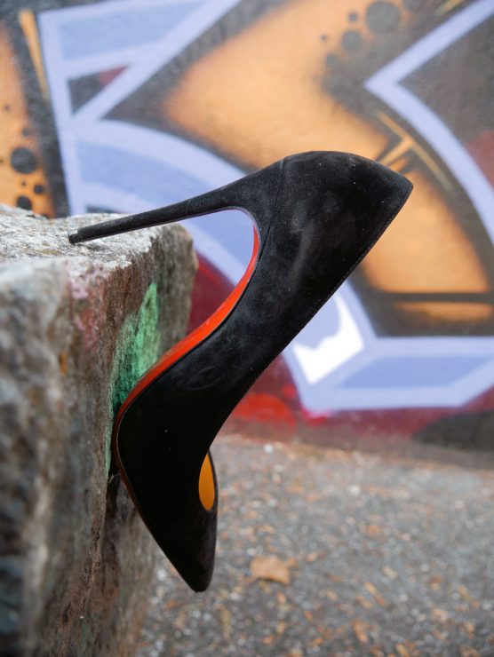
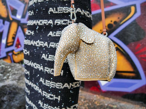
, all by Alessandra Rich, Elephant mini crystal-embellished suede shoulder bag by Loewe, Kate 100 suede pumps
by Christian Louboutin, and crystal-embellished cat-eye metal sunglasses
by Valentino.








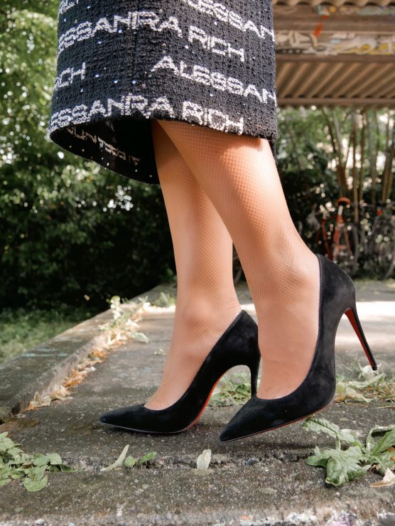






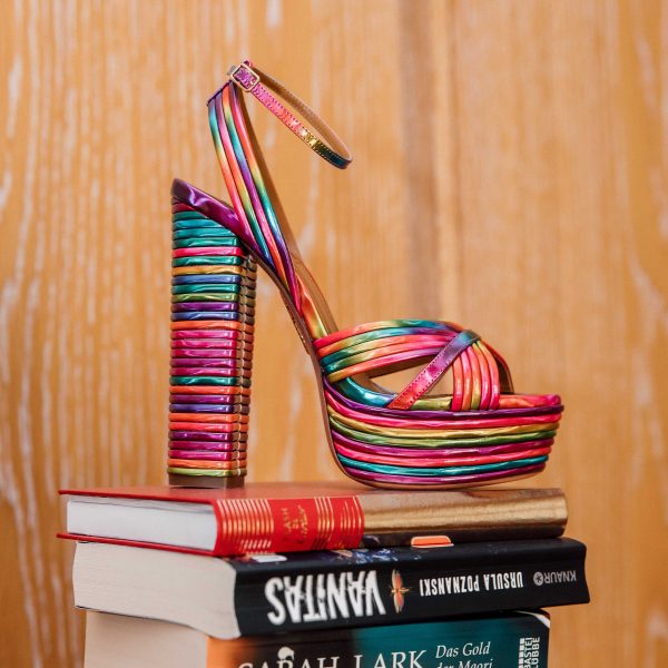
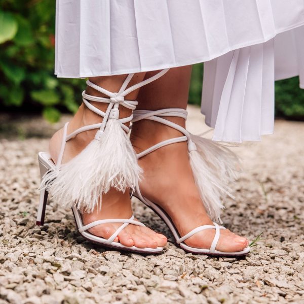
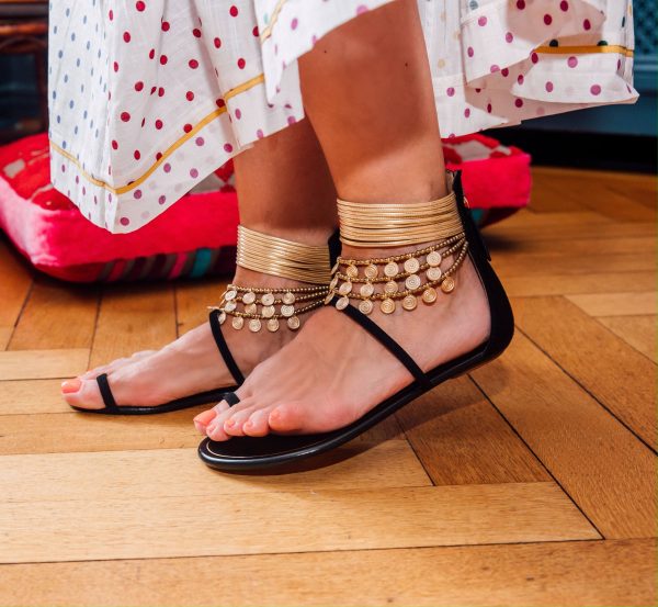
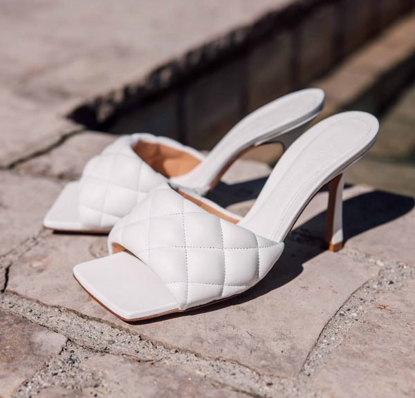
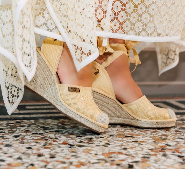
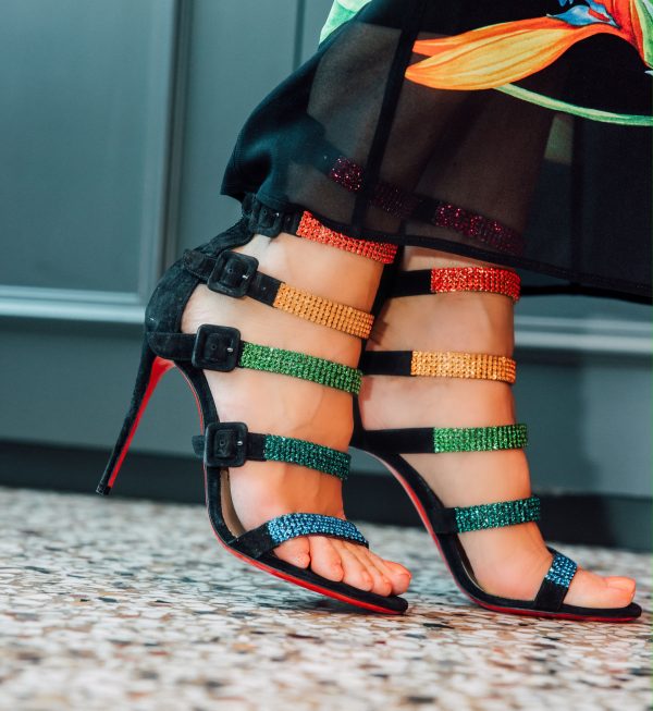

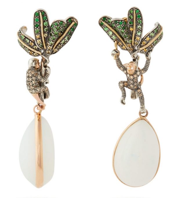
 And in case you are wondering why I didn’t call the post «monkey love», here is the answer. In the urban dictionary this expression stands for crazy animalistic sex requiring acrobatic poise. It can also be termed «monkey lovin‘». Isn’t it funny how you can go wrong just translating a word correctly?




 My first of May outfit:
 Christian Dior dedicated his whole Spring 1954 collection to his favorite flower.
 The Dior Hommes Fall 2014 collections full of lily of the valley details.
 The original Diorissimo bottle of 1956
 Dior Haute Couture S/S 2016
 Kirsten Dunst at the 69th Festival de Cannes in 2016
 The famous dress Muguet from 1957 was on display at the amazing V&A exhibition «
 Surprise for my daughter today: The beautiful Lucky scent engraved with her name and sign.
 Dior’s new Lily of the Valley china is so beautiful, click